In today's fast-paced digital world, having a website that looks great on any device is no longer optional—it's essential. Welcome to the era of responsive web design, a revolutionary approach that ensures your website provides a seamless experience whether viewed on a desktop, tablet, or smartphone. But why is having a mobile-friendly website so crucial? Let's dive into the numerous benefits of responsive web design and discover how it can enhance user experience and boost your SEO rankings.
Responsive web design is a method of web development that creates websites that automatically adjust to fit the screen size and resolution of any device. Unlike traditional web design, which often required separate designs for mobile and desktop, responsive design uses fluid grids, flexible images, and media queries to create a single, cohesive site that adapts to various devices. This flexibility ensures that users have an optimal viewing experience, no matter how they access your site.
The early days of web design were dominated by static layouts optimised for desktop monitors. However, with the proliferation of smartphones and tablets, the landscape began to shift. Designers and developers recognised the need for a mobile-first approach, prioritising mobile usability and gradually expanding to larger screens. This evolution has led to the widespread adoption of responsive web design as a standard practice.
Fluid grids are a cornerstone of responsive design. They use relative units like percentages rather than fixed units like pixels, allowing layouts to resize smoothly across different devices.
Flexible images adjust themselves to fit within their containing elements, ensuring they do not overflow or distort, regardless of the screen size.
Media queries enable the application of different CSS styles based on the characteristics of the device, such as its width, height, or orientation. This feature allows developers to tailor the design to various devices without changing the content.
A consistent user experience across all devices is one of the most significant benefits of responsive web design. Users can navigate your site easily, read content without zooming, and enjoy an overall smoother experience. Improved readability and intuitive navigation reduce frustration and keep users engaged longer, increasing the chances of achieving your website's goals.
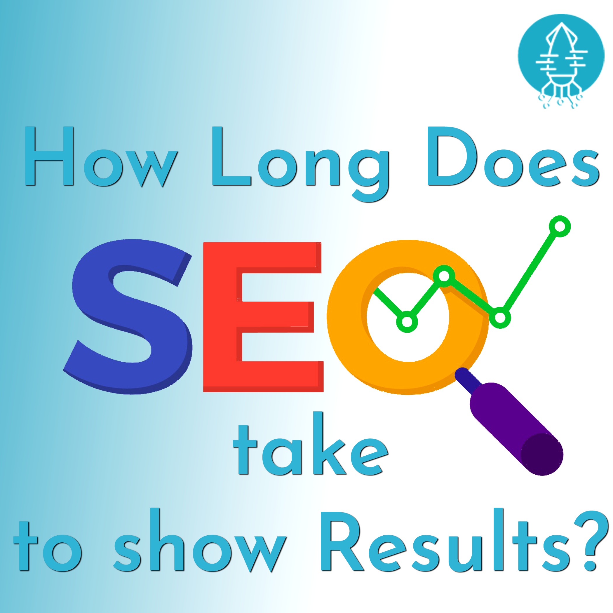
Google, the king of search engines, favours responsive websites. Responsive design improves SEO by offering a better user experience, which can lead to higher engagement and lower bounce rates. Moreover, having a single URL for both mobile and desktop versions of your site simplifies Google's job of indexing and ranking your content, leading to potentially higher search engine rankings.
Maintaining separate desktop and mobile sites can be costly and time-consuming. Responsive web design consolidates your resources, allowing you to manage a single site that caters to all devices. This consolidation reduces maintenance costs and simplifies your web management tasks, freeing up time and budget for other important areas of your business.
With mobile internet usage surpassing desktop, having a mobile-friendly website is critical for capturing a larger audience. Responsive web design ensures your site is accessible and functional on mobile devices, leading to increased mobile traffic and more opportunities for engagement and conversion.
Responsive web design emphasizes optimised images and resources, which contribute to faster loading times. Speed is a crucial factor for user experience and SEO, as slow-loading sites can frustrate users and lead to higher bounce rates. By improving site performance, responsive design keeps users on your site longer and enhances their overall experience.
The digital landscape is constantly evolving, with new devices and screen sizes emerging regularly. Responsive web design future-proofs your website by ensuring it can adapt to any new device that comes along. This adaptability saves you from having to redesign your site every time a new technology hits the market.
Tracking and analysing user behaviour is simpler with a responsive website. You only need to monitor a single site, resulting in unified analytics and reporting. This unified approach provides clearer insights into how users interact with your site across different devices, helping you make informed decisions to enhance their experience further.
A seamless user journey across devices leads to higher conversion rates. Whether users are filling out a form, making a purchase, or signing up for a newsletter, responsive design ensures they can complete these actions easily. Enhanced call-to-action effectiveness on a responsive site means more conversions and better business outcomes.
Responsive web design integrates well with social media platforms, making it easier for users to share your content. Improved social media integration leads to increased user engagement and more traffic to your site from social networks.
A consistent look and feel across all devices strengthen your brand identity. Responsive web design ensures that your website presents a uniform appearance, reinforcing your brand message and making a lasting impression on visitors.
In conclusion, responsive web design is not just a trend; it's a necessity in today's digital age. It enhances user experience, improves SEO, and offers numerous other benefits like cost-effectiveness, increased mobile traffic, and higher conversion rates. By adopting responsive web design, you're not only future-proofing your website but also ensuring it performs optimally across all devices. Embrace the power of responsive design and watch your online presence soar.


