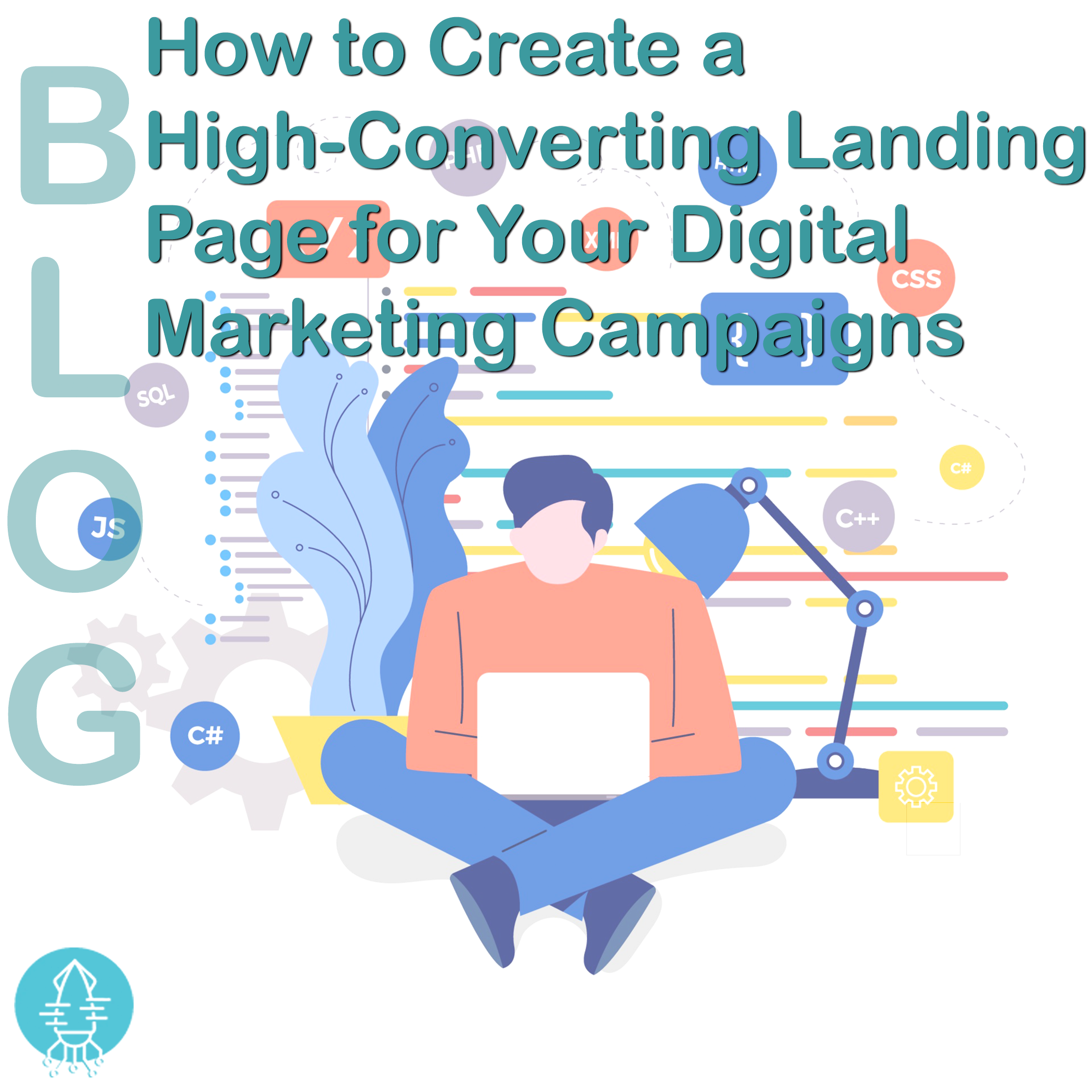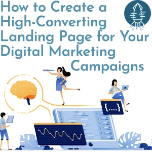
A high-converting landing page is the cornerstone of any successful digital marketing campaign. It’s the page where visitors either take action or leave without converting. Whether you're aiming for sign-ups, downloads, or purchases, the design, layout, and messaging of your landing page play a pivotal role in its effectiveness. In this blog, we’ll explore key strategies for landing page optimisation to maximise conversions and drive results.
A landing page is a standalone web page designed specifically for a marketing or advertising campaign. It’s where a visitor "lands" after clicking on an ad, social media link, or email promotion. The primary goal of a landing page is to guide visitors toward taking a specific action, known as the call to action (CTA).
Unlike your website's homepage, which may offer a variety of information, a landing page is focused, eliminating distractions and zeroing in on a single objective. To create a high-converting landing page, you need to optimise every element for user experience and persuasiveness.
Your headline is the first thing visitors will see when they land on your page, so it needs to grab their attention instantly. A great headline should be clear, concise, and benefit-driven. It should immediately convey the value of what you're offering and why visitors should care. Avoid vague language—be specific about what the visitor stands to gain.
Example:
Instead of "Improve Your Marketing Strategy," try "Boost Your Sales by 30% with Our Proven Marketing Blueprint."
A landing page should focus on just one primary goal—whether that’s getting visitors to sign up for a webinar, download a free guide, or purchase a product. Having too many CTAs or offering multiple options can confuse users and dilute your message. Keep it simple and drive them toward the singular action you want them to take.
With a significant portion of web traffic coming from mobile devices, it’s essential to optimise your landing page for mobile users. A high-converting landing page should be fully responsive, meaning it adapts seamlessly to different screen sizes. Ensure that your CTA buttons, forms, and images are mobile-friendly, and that loading times are fast on all devices.
Images and videos can significantly enhance your landing page’s appeal, but only if they’re relevant to your offer. High-quality visuals that align with your message can help reinforce trust and engagement. If possible, include product images, demo videos, or testimonials to show your offering in action.
For example, a landing page promoting a product trial might benefit from a short video showing how to use the product, highlighting its key features and benefits.
Your call to action is arguably the most important element of your landing page. It should be highly visible, action-oriented, and easy to understand. Use direct and compelling language that tells visitors exactly what they need to do next.
Common CTA examples include:
Make sure your CTA stands out visually, using contrasting colours and bold text to draw attention. Position it strategically above the fold and throughout the page so that it’s always easy for users to take action.
If your landing page includes a form for visitors to fill out, keep it as short as possible. Only ask for the most essential information to avoid overwhelming potential leads. For instance, requesting a name and email address is often enough for newsletter sign-ups or downloads.
The fewer fields you have, the higher your chances of conversion. If you need additional information, explain why it’s necessary to build trust with your audience.
Social proof, such as customer testimonials, reviews, or case studies, can significantly increase the credibility of your offer. Visitors are more likely to convert if they see that others have already benefited from your product or service. Displaying star ratings, customer logos, or short quotes from satisfied clients can provide powerful validation.
For instance, including a testimonial that says, "After using this service, our sales increased by 40% in just three months" adds real-world proof to your landing page.
When crafting the copy for your landing page, focus on the benefits of your offer, not just the features. Visitors want to know how your product or service will solve their problem or improve their lives. Instead of listing technical specifications, explain what the user will gain by converting.
For example, if you’re promoting a software tool, highlight that it “saves time and increases productivity” rather than just stating that it has “automation features.”
Encouraging visitors to act immediately can significantly boost conversions. You can create a sense of urgency by offering limited-time discounts, exclusive bonuses, or countdown timers. Scarcity makes visitors feel like they might miss out if they don’t take action soon, pushing them toward conversion.
Phrases like “Limited spots available” or “Offer expires in 24 hours” can encourage visitors to act quickly rather than leaving the page and forgetting about it.
Landing page optimisation is an ongoing process. What works for one campaign might not work for another, so it’s important to A/B test different elements of your page. Test variations of your headline, CTA, layout, colours, and imagery to see what resonates best with your audience.
Using tools like Google Optimize or Optimizely, you can run experiments to determine which version of your landing page drives the most conversions.
Creating a high-converting landing page requires careful planning, testing, and optimisation. By focusing on a clear goal, crafting compelling messaging, and optimising the user experience, you can significantly improve your digital marketing campaigns’ success.
Incorporate these tips into your landing page design to ensure that visitors not only stay on the page but take the desired action. With the right strategy, your landing pages can become powerful conversion drivers that boost your overall marketing ROI.